
Хамстерите като идеални домашни любимци: грижи и забавления
Все по-често днес хората се обръщат към хамстерите като към идеалния домашен любимец. С техния миниатюрен размер и приятелски характер, тези малки гризачи са чудесен избор за всеки, който търси компания и разнообразие в дома си.
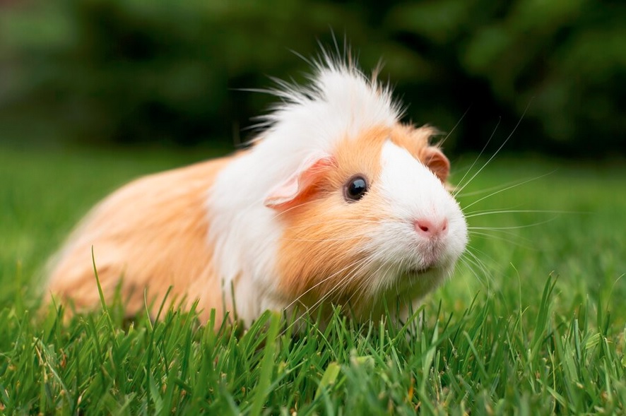
Най-популярните видове хамстери, които се държат като домашни любимци, са Златния, Сирийския и Руския хамстер. Всеки от тях има свои уникални характеристики и изисквания. За семейства с деца, игривият Златен хамстер може да бъде идеален избор, докато по-независимият Руски хамстер е подходящ за тези, които търсят по-спокоен любимец.
Какво трябва да знаем за грижите за хамстер
Грижата им изисква внимание към техните основни нужди. Клетката трябва да бъде достатъчно голяма, за да му позволява да се движи свободно. Осигурете му подходящи играчки и колело за трениране, като същевременно поддържате чистотата на клетката.
Забавления и интересни факти за хамстерите
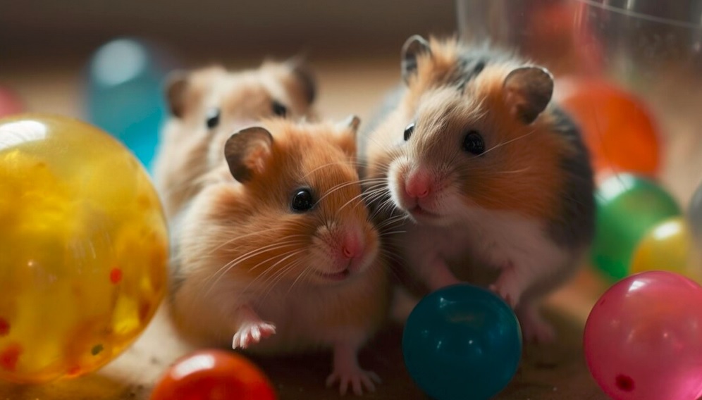
Хамстерите са любопитни и енергични същества. Те обичат да копаят и се крият в тунели, което ги прави уникални за наблюдение. Можете да им осигурите специални тръби и тунели, които ще стимулират техните инстинкти за изследване.
Правилното хранене
Тези сладки гризачи са изключително избирателни по отношение на храната си. Предоставете им балансирана диета, която включва семена, зърна и свежи зеленчуци. Избягвайте даването на шоколад и сладки храни, тъй като те са вредни за тяхното здраве.
Много популярни сред децата и възрастните, хамстерите са чудесен начин за поддържане на здравословен начин на живот. Задоволяването на техните нужди за движение и стимулация ще подобри не само тяхното физическо здраве, но и ще внесе радост във вашия дом.
Хамстерите са прекрасни домашни любимци, които изискват минимални грижи, но създават много радост и удовлетворение. С правилната грижа и внимание, те могат да станат идеални спътници във вашето семейство.
Още интересни и полезни статии можете да прочетете тук